
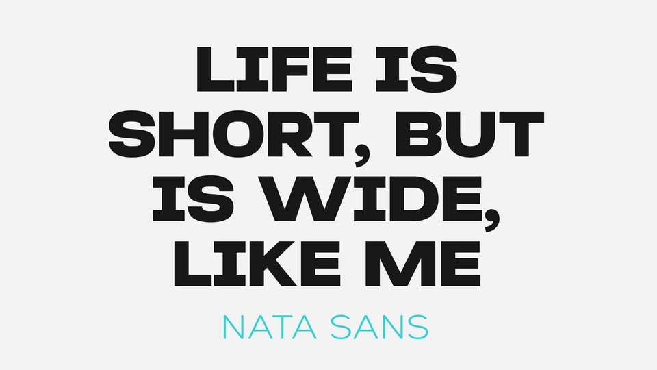

Nata Sans is a grotesque typeface with a subtle humanistic structure.
Designed for interfaces, with a generous x-height that adds a slight display look and feel. Nata Sans is a typeface with wide glyphs that contribute to generating a more relaxed, slow and clear reading.
With short ascenders and descenders, this typeface exudes a restrained personality, ideal as a substitute for the Helvetica typeface. The curvatures of the letters "o" and "a" contain the compositional principle that gives the font family a distinctive DNA.
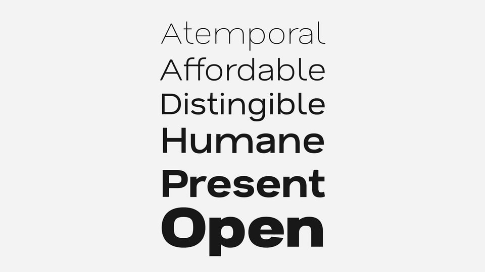
The font family is 100% Latin Plus, covering 219 latin based languages, which are spoken in different 212 countries. It is a variable font with six predefined weights ranging from thin to black. The font contains 702 glyphs. Each glyph has three dedicated drawing to ensure a perfect interpolation between all four weights.