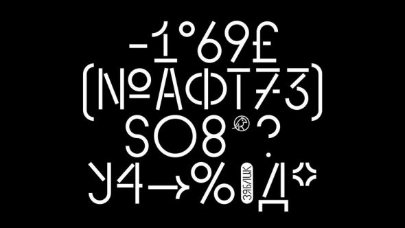
Sol typeface is based on two prevalent outlooks on the distant future that Stanisław Lem might have lived in between of: first—a more optimistic outlook in Western retrofuturism he was critical of and second—a more philosophical and pessimistic outlook that might have been more common in the Eastern Bloc. The more fluid and round Retrofuturism style has a strong emphasis on the Y axis that represents the vertical aspirations of man. And the more strict Brutalism style is loosely based on the Symmetriad designs one might find on various “Solaris” book covers and film posters.


