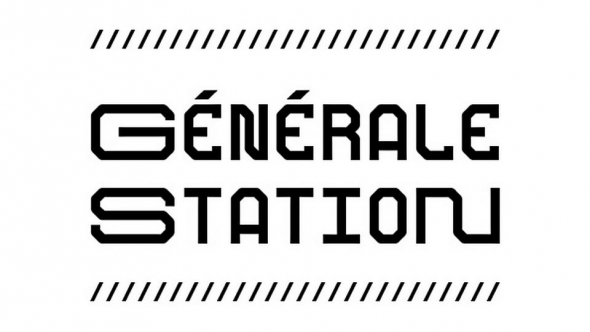
Gridular originally started as an experiment by Mark Bloom, whose admiration for Wim Crouwel’s grid-based type designs is often an inspiration for new typeface ideas. This particular design takes a cue from Crouwel’s Architype typeface, which uses a grid of interconnected pixels with slightly rounded corners and connections. CoType’s interpretation is a more playful take on a similar grid, striking a dynamic balance between the decorative and the functional.
Gridular greatly resembles a monospaced pixel font in its features, but you will notice that we added kerning and a few more proportional letters in order to help it perform better in running text. Most lowercase letters are drawn on a grid of 5 by 7 pixels (with a fixed width of 612 units), while the uppercase have their own grid of 6 by 7 (with a fixed width of 714 units). The punctuation and other symbols follow other dimensions, but are based on the same general grid.
Though not all symbols are monospaced, if you want to set some simple monospaced text to more tightly fit a grid, we’ve got you covered. In Stylistic Set 1 you will find monospaced alternates for the letters f, j, m, t, w, M, W, which are not monospaced by default. In this set, there is also an alternate version of the word space, set to the width of the lowercase. If you set your text to All-Caps while having Stylistic Set 1 turned on, the word space will adjust to be the width of the uppercase letters. For the last monospaced touch, turn off the kerning.
Next to monospaced alternates, you will also find special punctuation for use in all-caps, as well as a full set of arrows. This typeface features a Latin Extended character set, covering most languages written with the Latin script.


