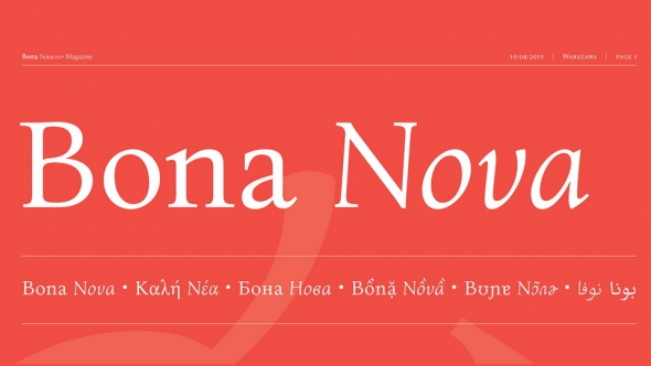
Elpis has been designed in order to be functional even at poor printing conditions. Baring this in mind, Elpis is a robust serif typeface with a rather tight and clean design so as to be suitable even for inferior paper or low resolution printing. With short ascenders and descenders thus increasing counter size, rounded, sturdy serifs and a humanistic axis, slight antithesis between thick and thin strokes, and its horizontality, Elpis incorporates rhythm and smoothness. The typeface is also accompanied by a set of non-lining figures and supports open type features such as ligatures, small capitals, old style figures, tabular figures and case-sensitive forms.
Elpis Greek, attempts a modern representation of the Greek script while respecting its long Latin independent tradition. The greek has been designed to blend optically with the Latin avoiding at the same time the ‘latinisation’ of its letterforms. Elpis was designed with an effort to create an overall matching texture to the Latin forms, for example in terms of color (stroke analogy, character width and height) and shape (resemblance of curvature and terminals, where that could be applied) the basic challenge being the combination of the Latin script that is prevailed by horizontal and vertical forms as opposed to the Greek that has mostly rounded forms. The letters maintain the fluidity of the script, each letter discreetly passing on to the next one, while balancing the variety of stress encountered in Greek letterforms. Elpis is an original design by Natasha Raissaki released by GFS as part of the ongoing effort to contribute to contemporary typography.


