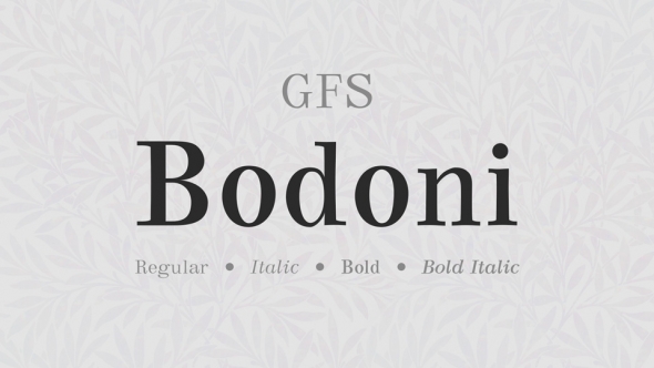
Festina Lente, between tradition and modernity - a typeface inspired by Italian Renaissance prints by Aldo Manutius.
Letter design is a very conservative and progressive activity at the same time - it is based on certain principles, but it changes with the progress of the language. One of the many challenges was creating characters that did not exist at the time, such as W, U, J or @.
The past cannot be viewed postmodernistically. It is also not about idealizing history, but about collecting its beautiful achievements that will help to improve the present and the future.


