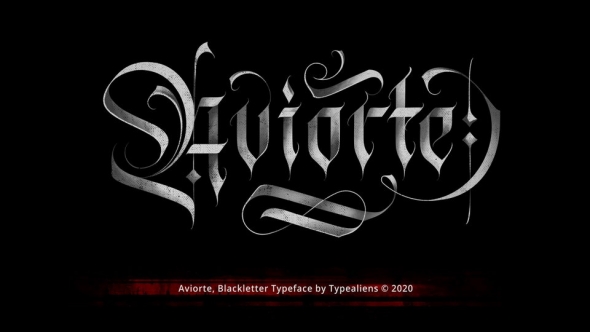
Donaire is my current interpretation of the classic Didonas, a modern Didona that pays homage to the elegant fat-face fonts that emerged in the late 18th century.
Inspired by modernist and historical aesthetics, I designed Donaire to capture the essence of those typefaces.
Donaire, with a square proportion, combines the visual strength of thick vertical lines and thin horizontal lines, accompanied by the delicacy of transitional serifs and teardrop endings, achieving a perfect balance between legibility and visual impact.
The font includes ornate drop caps, arrows, and other embellishments.


