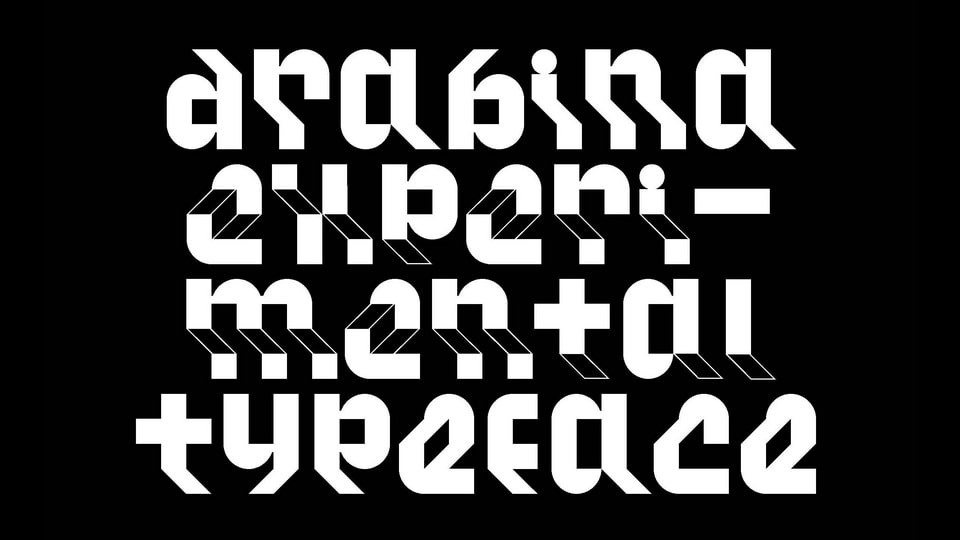
Amstelvar is a parametric variable font, inspired by the typeface designs used in The Netherlands and Belgium from the sixteenth century to the development of Times Roman in the 1930s.
Amstelvar includes a broad range of standard variables: weights from heavy to light, widths from wide to narrow, optical sizes from small to large, contrast, serif slope, and a few others which are currently on the drawing board.
“Weight” axis that lightens without change horizontally or vertically, to the white space, and darkens the same way, without decreasing the white space, just changing the black, and the widths of the glyphs.
Amstelvar also contains a “Width” axis, that reduces the transparent (white) shapes and spaces of the letters only, leaving the opaque (black) to the variations of the weight axis alone. Between these two, what I call “single parametric axes,” the “normal” weights and widths of a font family are found, along with the grades, which are different weights on the same metrics. This is currently a single-pole axis, i.e. from the default font, it only gets narrower.
A third axis, contains another, currently single-pole axis, usually called “Contrast” that alone, just varies the lighter horizontal and diagonal parts of the glyphs. These three together lend optical size capabilities to the uppercase, figures and most of the punctuation in a Latin script design.
To enable optical size capabilities for the lowercase, an “xHeight” axis is also present in Amstelvar, an axis for the descenders and ascenders is planned to complete the variations required for the composition of this family in text and display settings with any reasonable or unreasonable amount of line spacing.