
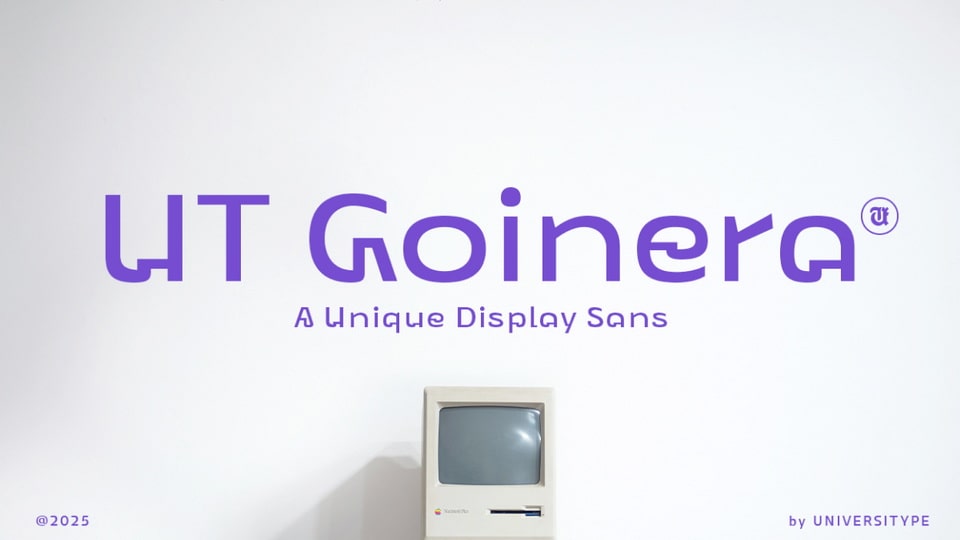
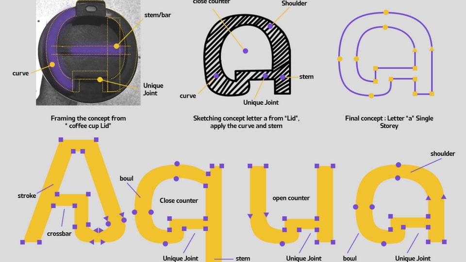
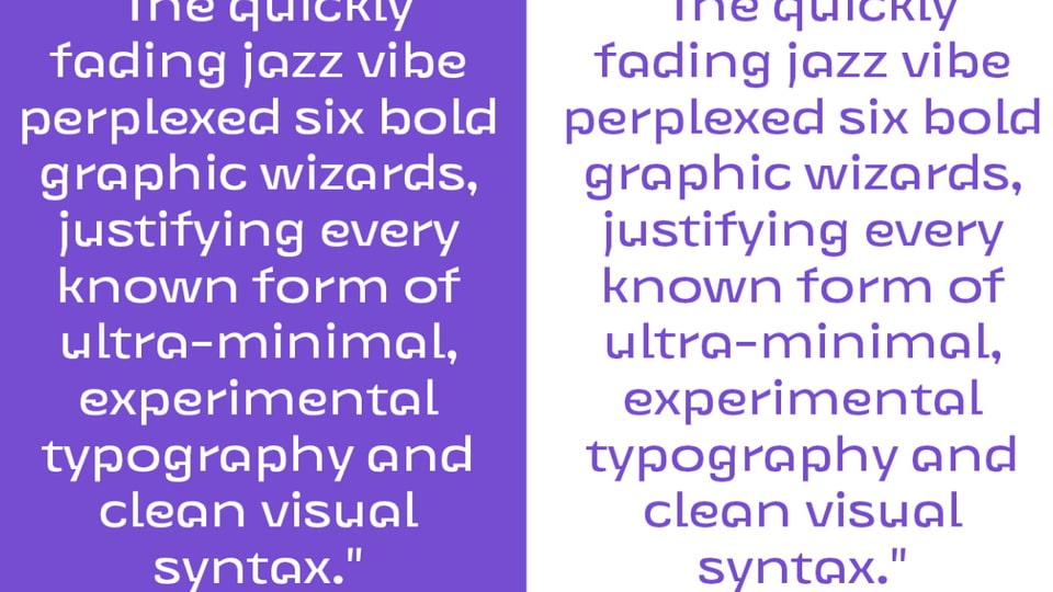

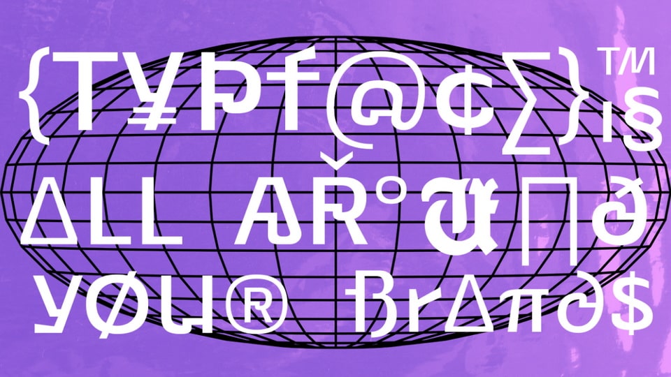
UT Goinera is a modern geometric typeface that finds its roots in the everyday, a coffee cup lid, to be exact. But don’t let the simplicity of the inspiration fool you. This font is all about clean structure with subtle quirks that bring warmth and personality to your work.
Designed with smooth curves, strong verticals, and distinctive joints, UT Goinera blends architectural precision with a soft, grounded tone. The result? A typeface that feels thoughtful, approachable, and effortlessly modern.
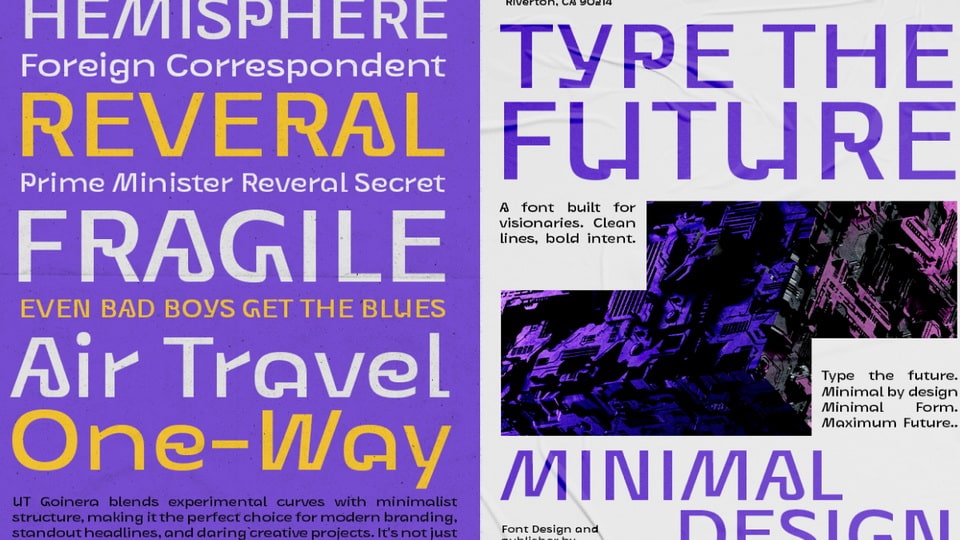
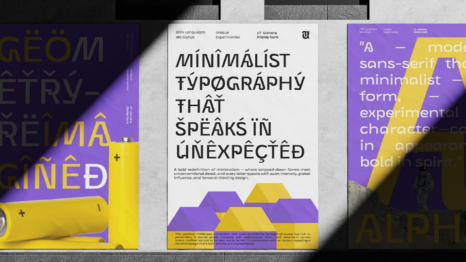
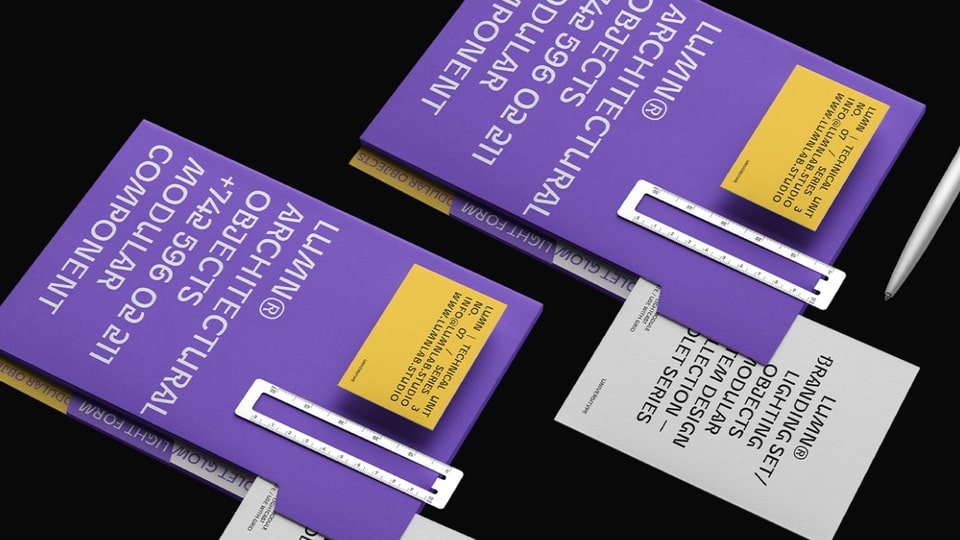
Whether you’re crafting a brand identity, building sleek UI layouts, or designing bold packaging, UT Goinera gives you a clean base with enough detail to stand out—without trying too hard.
Target Audience
Designers, branding experts, UI/UX folks, and creatives who appreciate thoughtful structure and subtle details. UT Goinera works beautifully for brands that want to feel approachable, modern, and distinct—whether it’s a minimalist skincare label, a calm tech product, or a thoughtful content platform.
Key Features
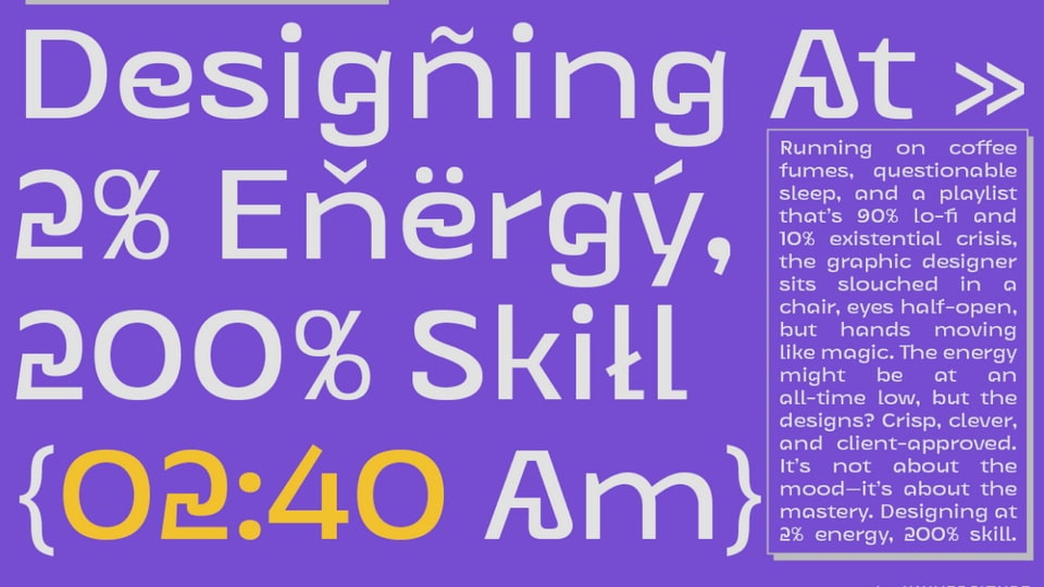
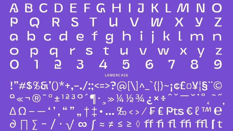
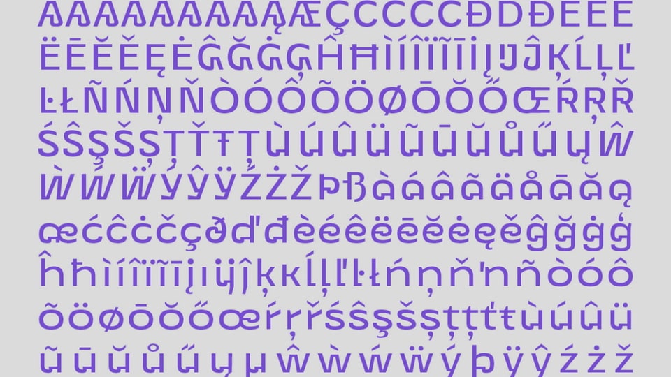
– Single-storey “a” and soft, round terminals
– Signature joint system inspired by real-world forms
– Geometric rhythm that feels balanced and readable
– Looks great in both large display and small text
– Friendly without losing its sense of order
Inspiration Behind the Design
The spark for UT Goinera came from something unexpected: a coffee cup lid. The way the form curves around, locks together, and creates a tight, satisfying closure—it felt like a blueprint for letter construction. The idea of translating those tactile forms into a font structure led to the signature “joint” system you’ll see across the letterforms. The single-storey “a” is a direct result of this exploration—where curves, stems, and bars meet in a way that feels both industrial and soft. It’s a typeface born from everyday design, elevated through detail.


