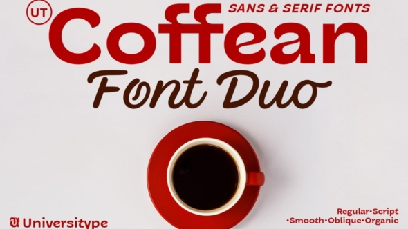
The creation of UT Coffean Font Duo began with a close study of the coffee bean’s anatomy. The aim was to capture its essence — a shape that resonates with warmth, richness, and comfort. Each character in UT Coffean Sans mirrors the bean’s organic form, with rounded edges, smooth curves, and a central “crease” that symbolizes both structure and softness. This subtle asymmetry adds a human, approachable touch, reminiscent of the coffee bean’s natural charm.
In UT Coffean Script, the design takes on a more fluid, handwritten quality, resembling the swirling motion of steam over a freshly brewed cup. The script style has a light, graceful movement, offering an inviting and personal feel. With variations like Smooth and Oblique, the font achieves a balance between structure and flow, making it adaptable to various moods and applications.
Every detail in UT Coffean was meticulously refined to embody the earthy appeal of the coffee bean, resulting in a versatile typeface that’s ideal for coffee brands, cozy cafes, and any project that seeks a warm, authentic touch.


