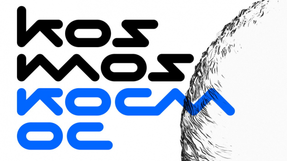
TWO TWENTY is a unique display typeface developed under the influence of 2020, which also explains the origins of its name (two twenties). It's designed with two lines of different widths (as well as the symbol "2"). Simple geometric shapes were used to emphasize the font's simplicity and easy visual perception. Some letters and numbers have been designed from scratch to reflect their history.
2021 design. TWO TWENTY Regular font can be used in various styles. It perfectly stands out as a brand mark, so many logo designers can simply combine it with other fonts. This font also suitable for highlighting key elements, numbers, or just a word in printing industry. Thus, TWO TWENTY Regular font was inspired exactly by it, by Less it more trend.


