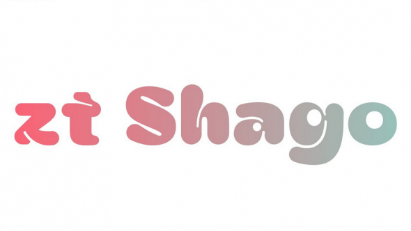
Mourier is a quasi-abstract geometric typeface originally created by Eric Mourier in 1971 following a strict set of rules.
In 2002, Sébastien Hayez adapted the typeface as a digital font, with the approval of its original designer, which was afterwards published as part of the Velvetyne Type Foundry collection in 2011. Then, in 2020, Ukraininan designer Alex Ash (Alexander Kondratenko) proposed a Cyrillic alphabet expansion of the font, of which he had imagined the capitals. Ariel Martín Perez took this opportunity and developed lowercase letters for Latin and Cyrillic scripts (with feedback from Alex Ash for the Cyrillic), added diacritics and symbols, mastered the font and also created several sets of alternates.
About the original design, in Eric Mourier's own words:
"About the lettering, it may be stated that the individual letters have been designed on the basis of a rigorous, detailed scheme: Forty-nine squares, black and white in rows alternately, no closed areas, gaps the size of one square, etc. Within this scheme, the aim has been to obtain the greatest possible likeness to ‘ordinary’ letters, and, simultaneous, a logical system of forms. The letters c and u, k and y, a and v, to exemplify, are identical, only variously turned.
The letters have been transferred to film, cut apart, and mounted seperately on self-adhesive foil, page by page."


