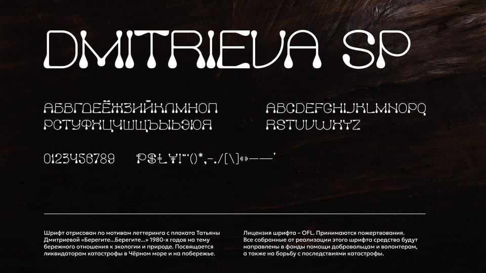

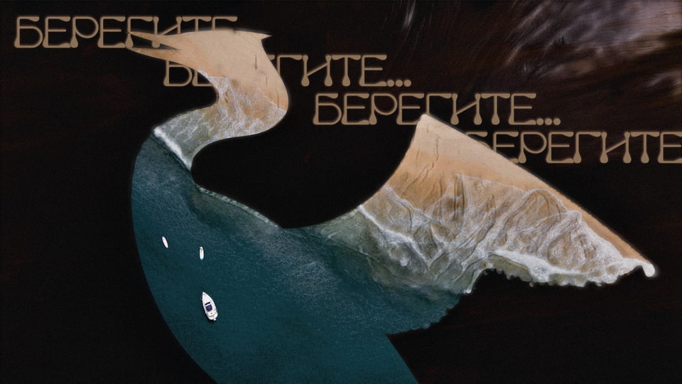
Dmitrieva SP is a font based on the lettering from Tatyana Dmitrieva's poster "Take Care... Take Care..." from the 1980s on the theme of careful attitude to ecology and nature. On the poster, the words seem to dissolve in space, emphasizing the fragility of nature and the importance of preserving it.
Soviet lettering of that time often balanced between laconicism and emotionality. The lines and shapes of Dmitrieva's letters look natural, as if created by nature itself, which makes the poster a strong visual appeal to take care of the world around us.
The created font rethinks these ideas, maintaining a connection with the original design, but introducing modern elements. Thin lines, teardrop-shaped details and the general character of the font emphasize environmental issues, reminding us of the need to care for the planet.
Donations are accepted. All funds raised will be directed to help volunteers and to combat the consequences of the disaster.