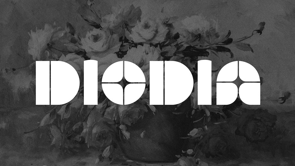
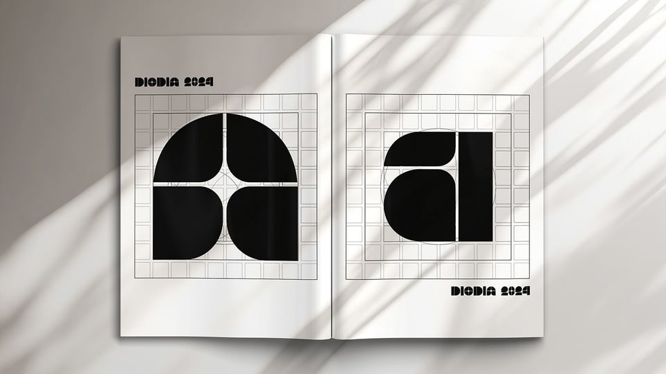
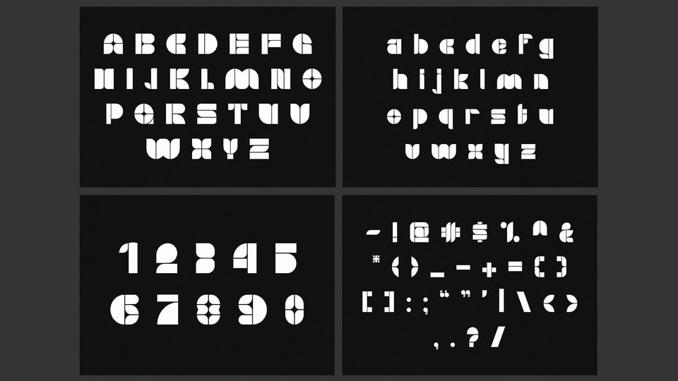
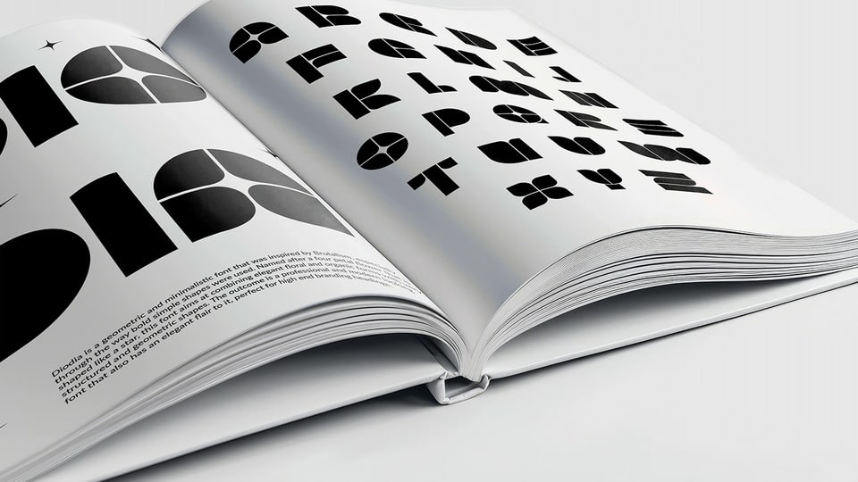
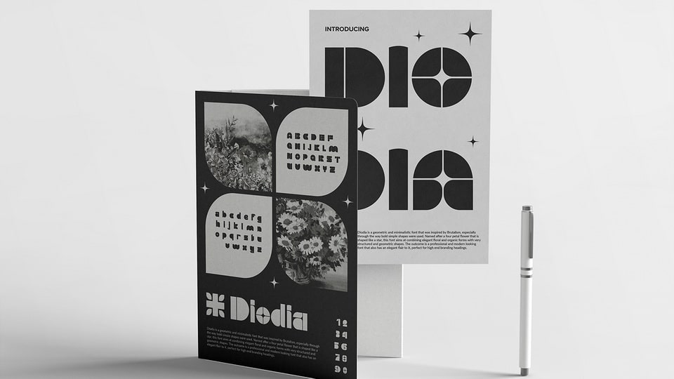
Diodia is a brutalist inspired font that is constructed using bold and simplistic shapes. This gives it a very structured appearance but to add in contrast, the letters were given a floral and elegant flair. This is meant to depict the contrasting beauty between man made creations and nature. These stark contrasts give the font two distinct personalities and aesthetics that, while they are different, go very well together. The simplistic shapes give the font a modern, structured and professional feeling, while the addition of curvy and organic shapes add in the feeling of elegance, serenity and gentleness. Another way contrast is added is through the use of very bold shapes in comparison to very thin spaces in between. These small spaces help separate the shapes, giving the font its distinct disconnected look, while still being close enough that the letters are still readable.
The target audience for this font will be high end and professional businesses who want a typeface that is not only structured and simplistic, but also elegant. This is a font that will be best used in text that will be read from a distance due to its bold design. Therefore it could be used in posters, adverts or signs. Businesses that fit into my target audience will include fashion, watch, jewellery or architect companies. What these businesses all have in common is that they are design centric while often being modern and caught up with the latest trends. This font fits a timeless and minimalistic look, while also having an elegant aesthetic that ties into the beauty of the designs these companies create or sell.